
Alright, let’s address the elephant in the dark room: pure black (#000000) is not your friend.
I know what you’re thinking. “But, dark mode literally means… dark. Black. The absence of light.”
Here’s the thing — if you’re slapping #000000 on your backgrounds and calling it “dark mode,” you’re doing it wrong. And your users’ eyeballs are paying the price.
The Pure Black Problem
Let me break down why #000000 is basically the design equivalent of wearing a scratchy wool sweater in summer — technically it works, but why would you do that to yourself?
Problem #1: OLED Smearing
On OLED screens (which is most modern phones and high-end monitors), pure black pixels are completely turned off. Sounds efficient, right? Wrong.
When you have white text on pure black, those pixels have to go from completely off to completely on. This creates a visual artifact called “smearing” — basically a ghostly trail when you scroll. It looks like your screen is drunk. Literally.
Problem #2: Eye Strain from Hell
Pure black with bright white text creates maximum contrast. Your eyes are basically getting whiplash trying to adjust between the two extremes. It’s like staring at a flashlight in a coal mine.
After 10 minutes of reading white text on #000000, your eyes feel like they’ve run a marathon. Not the experience you want.
Problem #3: Zero Depth Perception
Pure black is a visual void. Everything sits on the same plane. There’s no hierarchy, no sense of space, no way to tell what’s in front of what.
Your UI ends up looking flat and lifeless, like someone printed your interface on a sheet of black construction paper.
What the Pros Actually Use
Let’s look at what companies who actually know what they’re doing use for dark mode:
Spotify:
#121212(not pure black)YouTube:
#0F0F0F(not pure black)Discord:
#36393F(definitely not pure black)Twitter/X:
#15202B(dark blue-gray)Slack:
#1A1D21(very dark gray)
Notice a pattern? Nobody uses pure black.
These companies have entire design teams and millions of users. If pure black was the move, they’d use it. But they don’t. And neither should you.
The Elevation Tint System
Instead of thinking “dark mode = black,” think of it as layers of darkness getting lighter as they come closer to you.
Imagine you’re in a dimly lit room at night. Things closer to you catch more light and appear slightly lighter. Things further away fade into darker shadows. That’s elevation in dark mode.
The rule is simple: the closer something is to the user, the lighter it gets.
Visual Example
Look at the homepage from the Spotify web app:
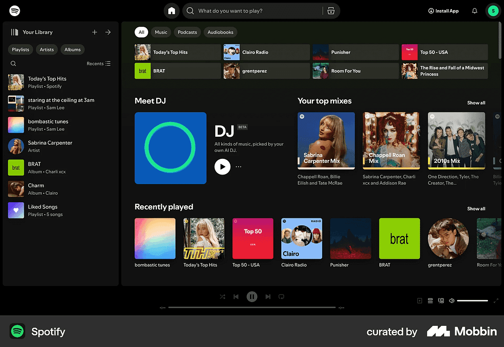
Each layer is distinguishable but still feels cohesive. The interface has depth and breathing room, and each element is easily accessible and not hard on the eyes.
The Color Temperature Trick
Here’s a pro move: don’t just use gray. Add a subtle color temperature to your blacks.
Cool Dark Mode (modern, techy):
Base:
#0F1419(very dark blue-gray)Use for: apps, dashboards, tech products
Warm Dark Mode (cozy, readable):
Base:
#1A1614(very dark brown-gray)Use for: reading apps, creative tools, content platforms
Neutral Dark Mode (safe, professional):
Base:
#121212(true dark gray)Use for: productivity tools, business apps
The temperature adds personality without being obvious. Users won’t consciously notice, but it sets the mood.
Text on Dark: The Other Half of the Equation
Okay, so you’ve fixed your backgrounds. But if you’re still using pure white text (#FFFFFF), you’re only halfway there.
Text Hierarchy in Dark Mode
Primary text (headings, important content):
Use:
#FFFFFFat 87% opacity OR#E0E0E0High contrast, but not painful
Secondary text (descriptions, labels):
Use:
#FFFFFFat 60% opacity OR#999999Readable but clearly secondary
Tertiary text (captions, timestamps):
Use:
#FFFFFFat 38% opacity OR#666666Still legible but de-emphasized
Disabled text:
Use:
#FFFFFFat 25% opacity OR#4D4D4DClearly not interactive
Notice how we’re using opacity OR hex values? Pick one system and stick with it. Mixing both gets messy fast.
Common Mistakes to Avoid
Mistake #1: Using pure black “just for the navbar” Nope. If you’re using elevation tints everywhere else, that pure black navbar is going to stick out like a sore thumb. Keep it consistent.
Mistake #2: Making elevation jumps too big If your base is #121212 and your next level is #404040, which appears greyed-out, that's too much. Keep increments subtle – around 5-8% at a time.
Mistake #3: Forgetting about borders On pure black, borders disappear. On dark gray, you need to think about border colors. Use something like #FFFFFF at 8-12% opacity for subtle dividers.
Mistake #4: Not testing with real content Your dark mode might look fire with lorem ipsum and placeholder images. Test it with real text, real photos, and real user-generated chaos.
Tools to Help You Out
Color palette generators:
LeonardoColor — Generate accessible color scales
Coolors — Quick palette generation with dark mode preview
Material Design Color Tool — Google’s color system
Testing tools:
Your actual phone (seriously, this is the best tool)
Chrome DevTools (emulate different screens)
Contrast Checker — Ensure text is readable
The Bottom Line
Pure black looks cool in Figma. It looks professional. It feels like the “correct” choice for dark mode.
But in reality? It’s lazy design that hurts your users.
Dark mode isn’t about making everything black — it’s about creating a comfortable, low-light experience with depth and hierarchy. And that means using dark grays with subtle elevation tints.
So next time you’re about to type #000000 into that background color field, stop yourself. Take a breath. Type #121212 instead.
Your users’ eyeballs will thank you.
That’s the tea, folks. Catch you later 👋
